The Beginner’s Guide to Descriptive Statistics
Author: Kirstie Eastwood
You’ve collected your data, and you’re sitting in front of your laptop faced with a spreadsheet full of data entries. Just looking at that data set, you are not able to get an overview of what’s going on. Understanding descriptive statistics is the first step in mastering your statistical analysis. Descriptive statistics equips us with a range of techniques that we can use to summarize the basic features of our data and present it in an easily understood manner. Descriptive statistical methods provide techniques that help summarize and graphically display data.
Descriptive statistics help us answer questions such as:
- How many people participated in your study?
- How many of them were males?
- How many of them were females?
- How many of them were interns, junior management, and senior management?
- What was the mean age?
- What was the mean salary?
Although descriptive statistics summarizes your data, it does not extend beyond your data set and cannot be used to make inferences about the broader population. From descriptive statistics alone, all one may say is, “These are my study participants, and these were their responses. This is the sample characteristic profile of my participants, and this is how they answered these questions”. If you want to make inferences about the broader population, you will need to move on to inferential statistics.
But back to descriptive statistics…
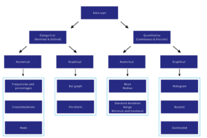
There are two approaches to descriptive statistics: (1) numerical and (2) graphical.
Numerical Descriptive Statistics
Numerical descriptive statistics can be separated into two main areas: (1) measures of central tendency and (2) measures of dispersion.
Measures of central tendency
Measures of central tendency provide you with a one number summary of the “typical” value within a dataset. It is a single number that is most representative of the entire dataset. The most used measures of central tendency include the mean, median, and mode.
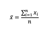
Mean: Aims to find a representative midpoint of a variable. The mean is only valid when used with continuous variables. If the mean is used on categorical data, ensure that the variables are ordinal with at least 4 categories. It is calculated by adding the values of each observation and dividing by the number of observations. Since the values are being summed, the mean is sensitive to extreme values as they will inflate or deflate the result.
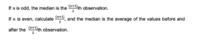
Median: Half the values in data set are smaller than median and half the values in data set are larger than median.
To compute the median, order the data from smallest to largest.
Mode: The observation in the data set that occurs the most frequently. Predominantly used for nominal scaled variables.
So, what is the relationship between the mean, median, and mode?
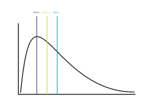
If the distribution of the variable of interest is symmetrical, then the mean, median, and mode are the same and lie at center of the distribution.
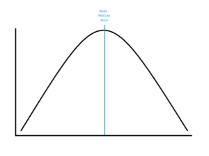
If the distribution of the variable of interest is skewed to the left, then the mean < median < mode.
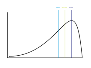
If the distribution of the variable of interest is skewed to the left, then the mode < median < mean.
Measures of dispersion
The most common measures of dispersion include the standard deviation, variance, range, and minimum and maximum. Measures of dispersion answer the question: How spread out are the data?
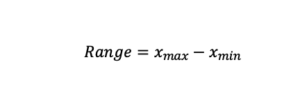
Range: Difference between maximum and minimum value.
Variance and standard deviation: Reflect variability around the mean.
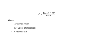
Variance: The average of the squared differences between each value of a variable and the mean of that variable.
Standard deviation: The square root of the variance and has the same units as the original data.
Graphical Descriptive Statistics
There are many options of graphical displays that you can make from your data. The choice of graph should be guided by what data type you are working with as well as what you want to display. Graphs can be used to visually inspect variable distributions and identify patterns in the data or between variables.
Some of the commonly used graphs are outlined below:
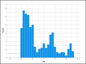
Histogram
Histograms are used to display continuous variables. It allows you to inspect the distribution (shape) of a continuous variable. It provides a quick overview of the variable’s central tendencies, dispersion, outliers, skewness, etc.
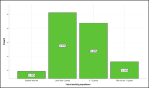
Bar Graph
Bar graphs are used to display the frequencies or percentages of categorical data (nominal or ordinal).
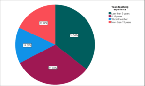
Pie Chart
Pie charts are mainly used for comparisons and to indicate compositions. When making use of pie charts ensure that the categories are minimised to allow for easier interpretation.
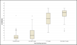
Boxplot
Boxplots display the distribution of continuous variables. One advantage of boxplots is that they allow you to compare the variable of interest’s distribution across different groups. It provides a quick overview of each of the group’s central tendencies, dispersion, outliers, skewness, etc.
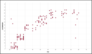
Scatter Plot
Scatter plots are visual displays of the relationship between two continuous variables.
Are you unsure what numerical and graphical descriptive statistics to report? This flowchart will help you navigate the appropriate statistics to report depending on your data type.